

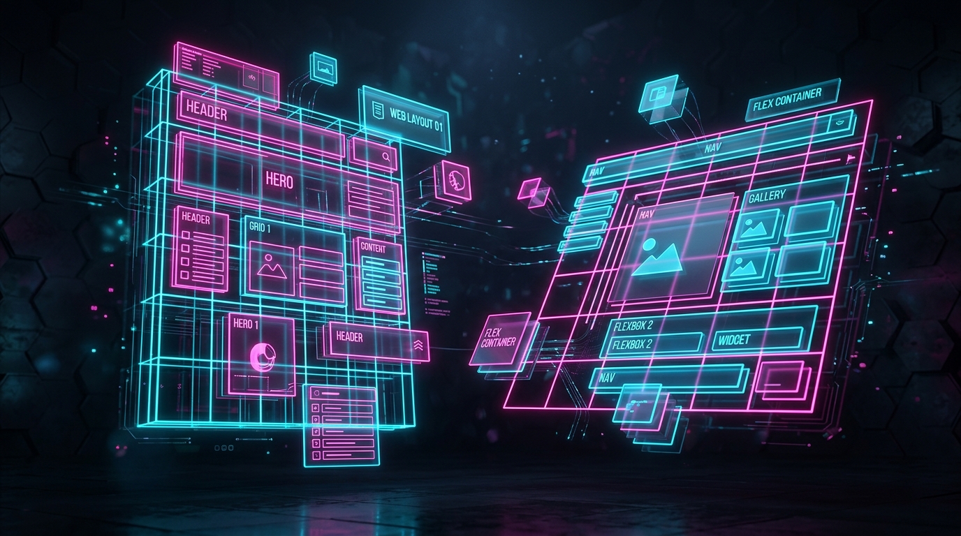
For years, web developers struggled with floats, positioning hacks, and complex frameworks just to create basic layouts. Then came Flexbox and CSS Grid, two powerful native CSS layout modules that revolutionized how we build the web. But a common question persists: Which one should I use?
The short answer: Use Flexbox for 1-dimensional layouts (rows OR columns) and CSS Grid for 2-dimensional layouts (rows AND columns).
CSS Flexbox: The 1-Dimensional King
Flexbox (Flexible Box Layout) was designed to lay out items in a single direction—either horizontally in a row or vertically in a column.
When to use Flexbox:
- Navigation Bars: Aligning a logo on the left and a cluster of links on the right.
- Centering Elements: The easiest way to perfectly center an item horizontally and vertically (
display: flex; justify-content: center; align-items: center;). - Aligning Items within a Component: Distributing space between buttons, icons, or text inside a single container (like a card).
Flexbox excels at taking a group of items and figuring out how to distribute the available space between them in one direction.
CSS Grid: The 2-Dimensional Master
CSS Grid Layout is the most powerful layout system available in CSS. It allows you to create complex layouts involving both rows and columns simultaneously.
When to use CSS Grid:
- Overall Page Layouts: Defining the structure of your entire page (Header, Sidebar, Main Content, Footer).
- Galleries and Card Grids: Creating a grid of product cards that neatly wraps and aligns in both directions.
- Overlapping Elements: Grid makes it incredibly easy to intentionally overlap elements without relying on messy absolute positioning.
The Best Approach: Use Both Together
The real magic happens when you stop viewing them as competitors and start using them together.
A common, highly effective pattern is to use CSS Grid for the macro-layout (the overall structure of the page) and Flexbox for the micro-layout (aligning the content inside the individual grid areas).
By mastering both, you'll be able to build any layout imaginable cleanly and efficiently.
Looking to speed up your frontend development? Check out our Web Design and Developer Utilities at ToolPuma to generate CSS, format code, and much more.